Monday 12 December 2011

Studio Update 12/12/11 - Collage

Three walls now covered:

Centre Wall
Integration of colour
Use of board module and yellow picked up from cardboard chip boxes
Triangular yellow wedges, diagonally across boards setting up tension with strictly horizontal /vertical format   (Ref Lothar's Colour Installations in his Talk of 5/12/11)
Decide on shift in intensity of colour as form gains height. Act almost as shafts of light from the high window in the space, but with density inverted from the 'natural order'.


Hockney / Sefton Park / Tate Liverpool

To Saltaire to view some of Hockney's work.
What always strikes me is how full of life his work is.
  • drawing skills are manifest with much energy in line and cross hatching
  • inveterate experimenter, embracing latest technology- currently doing flower piantings every morning on his ipad and sending them to his friends so they have fresh flowers every day!
  • disappointingly his latest very large Bridlington tree paintings were not being shown
  • colour being pushed more and more in his landscape work- strong purples, blues, oranges giving a very vibrant palette.
Sefton Park, Liverpool
Interested as the renovation of historic parks was one of the specialist areas I engaged with when practicing as a landscape architect.
Park design result of a competition which was on by a Frenchman, Edouard Andre, who worked in conjunction with a Liverpool architect, exhibits most of the classic elements of a late C19 park (opened in1872):
  • Enclosing woodlands, large areas of grassland, serpentine pathways, satatuary, bowls, tennis water features and a superb Palm house .
How could these 'classic park elements'  be expressed in paint without being directly descriptive?
Texture is a key component and widely  expressed:
  •  fine textured grass /course grasses/ clipped box and yew. Course holly providing a dark and occasionally reflective background
  • gravel /smooth marble/ stone with lichen patina
Water, textureless- reflective

Colour
This, of course, is dynamic and changes during the day and the season. Seasons, I am sure, have been done to death but could form an interesting series of paintings and would get me slightly closer to my goal of addressing 'time in the landscape'

Compositional posibilities:
  • Series of vertical coloured bands, taken directly from the palette of the park
  • Possible basis for determinig width of bands - based on approx proportion of the particular element in the park e.g grass say 60% woodland 15% paths 5% other elements constituting the balance -maybe too restrictive but proivides a rationale. Probably need to add a notional quantity for 'sky' as this is an integral part of the landscape exxperience.
  • If go along the seasonal route some colour shifts would be quite marked while others more or less a constant - e.g lime leaves going  from young sap green through to strong chrome/ cadmium yellow whereas yew/ holly remain as a constant. Therefore band widths in each painting would remain a constant but some of the colours would change.
  • Does it have to be 'the four seasons'? (Alarums / enter bear stage right / Vivaldi)
  • Square format canvass as 'record' rather than landscape statement, however the eye would read the paintings together in 'one landscape sweep'

Sunday 4 December 2011

Colour and Composition Workshop - Nov 5th

Occasional workshop run by artist, friend, Barrie Ormsby.
Chance to explore ideas of time in relation to landscape and explore low technology! (use of OHP)
  • Using photo of Spanish courtyard to provide basis for acetate outline
  • First lesson - projector will not focus down sufficiently to include three images on the canvas board I have brought  along. Have to use much larger board which is good in some ways.
  • Charcoal images made - 3 similar images
  • Colour added l to r 'Early morning, ''High noon', 'Early Evening'


    Studio Update 2/ 12 /11

    Now cleared Chicken/ Agricultural based collage to start anew in the large space fronting Steve's office.

    Attempting to use the architecture of the space rather than use wall as a pin board for sticking collage material to.
    Modular nature of pinboard significant.


    Materials:
    Timber offcuts
    Cardboard boxes
    Small square canvasses


    Materials taken across door and onto adjacent wall.
    Verticals pushing above line of notice board and  engaing with the wider space.
    Colour limited to natural wood/ buff of cardboard boxes with strong black/yellow graphics/ white of unused canvasses.


    Materials taken onto third wall
    Vertical / horizontal timber slats conform to overall dimensions of rectangular canvasses.
    Same colour restraint observed but with magenta substituted as the dominant colour.


    Saturday 26 November 2011

    Lumiere- Durham City

    Crown of Light  ( Ross Ashton, Robert Zeigler, John del’ Nero, UK)This centrepiece is definitely Son et Lumiere, the organ music an essential element of the work. The visuals are a stunning projection of images from the Lindisfarne Gospels onto the backdrop of the Cathedral. The scale and power of the images is quite something and it seems to be a true celebration of a strong strand of northeast heritage. I saw this two years ago and it has lost none of its punch.
     Inside the cathedral a series of illuminated, vest like objects are arranged way up into the
     nave and  chancel – spirits from another age?   
     A wide range of additional works from an international cast of artists are ranged around   the river banks and adjacent streets. Many allow a much more inmtimate and reflective     experience        

    Les Voyageurs (Cedric le Borne, F)
    Chicken wire figures suspended over the  South Bailey. Wire presumably dipped in light reflective paint. Elegant figures floating in space.
                                                           
                                                
    Plenum  (Simeon Nelson, UK)
    Inspired by his fascination with complementary and conflicting accounts of creation found in religion and science. Intriguing projection onto the  face of St  Oswald’s church – starts as a perfect grid of dots which slowly deteriorate into random patterns. V. Powerful nad simple ( in the best sense) work.

    I Love Durham  (Jacques Rival  F)
    Great.  Essentially playful piece. The statue of the Marquess of Londonderry has been covered in a plastic sphere with artificial snow being blown around inside. Takes me straight back to the childhood  toy  spheres which you shook and turned over before setting them down to provide their snowstorm.

    Splash  ( Peter Lewis, Canada)
    Transformation  of Ove Arup’s Kingsgate bridge into giant waterfall,  beautifully lit with clear white light and best approached by walking along the riverbank from Prebend’s bridge. Quite magical viewed through the tracery of trees- movement, transience, light.


    Wednesday 23 November 2011

    Studio Progress 2

    Collage progression
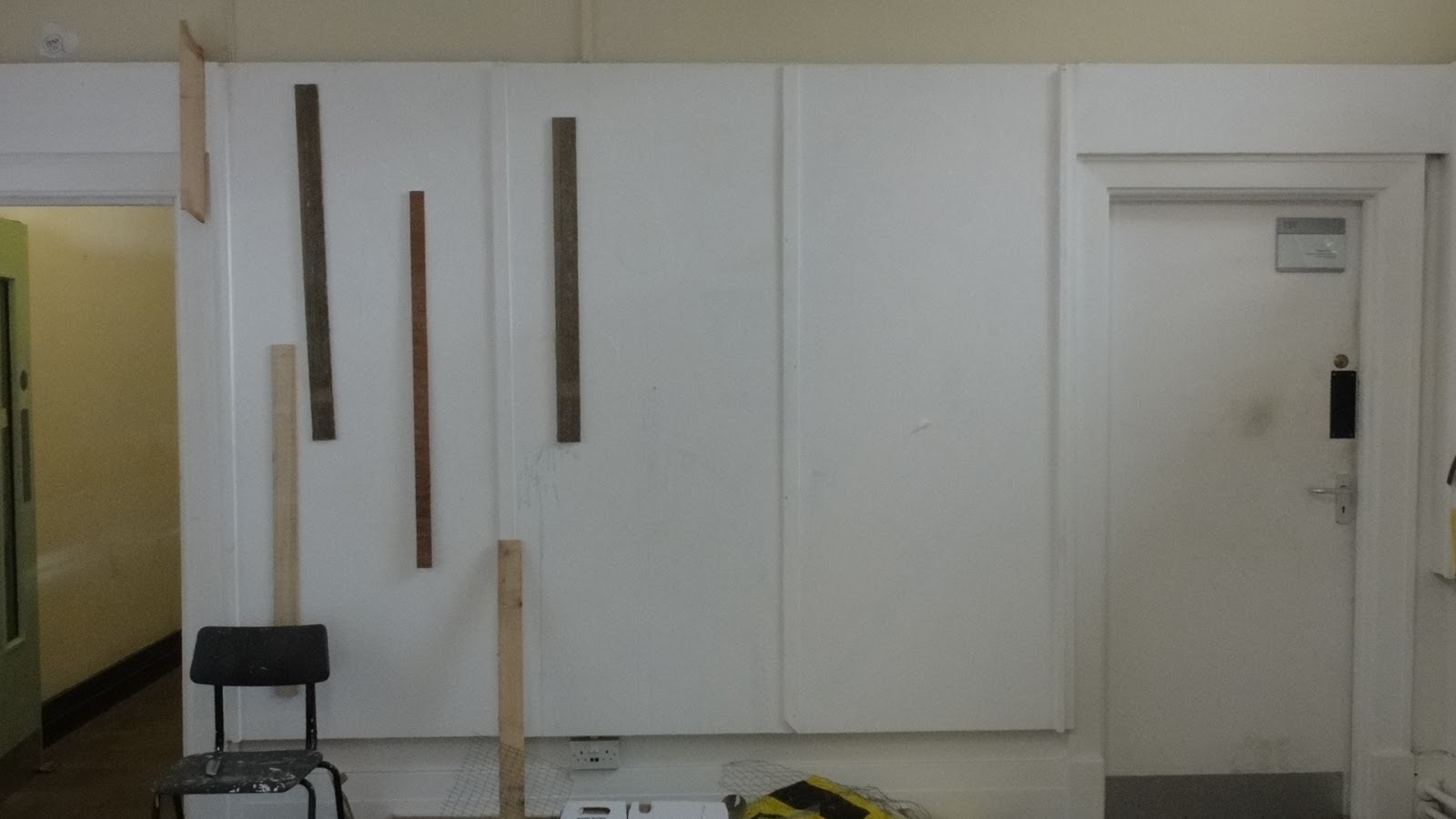
    1)    Use of lining paper, cut into rectangles approx 500x800, single colour acrylics as source material for tearing cutting into strips. Range of colours loosely derived from paintings based on Isla del Sol and Robbledio.
    Most interesting effects from strips of differing sizes. Tension between cut and torn edges interesting.
    Feed back from VB – suggest try colours of varying opacity as my current range are all pretty uniform and well saturated.

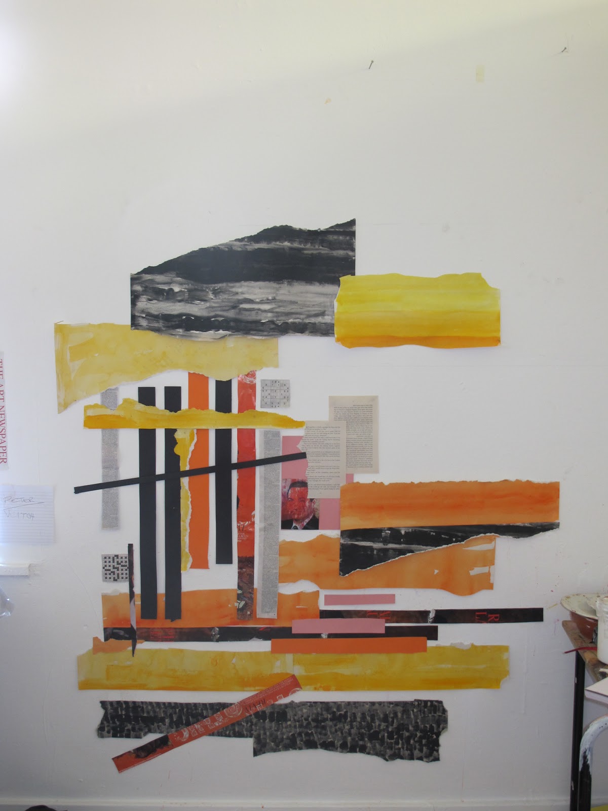
    2)     Varying the opacity liberates possibilities.
    3)    Widening range of material
    Integration of photos / text from magazines / newspapers. This adds whole new narrative potential, even if not ‘consciously created’! Colour palette greatly reduced which helps hold composition.
    'Stripe version attempted, leaving white gap between each colour. Develped vertically but looks rather like rug hanging on the wall! Try various orientations with VB - horizontal version definitely an improvement.

    VB suggests go bigger and use studio wall directly.

    First wall piece
    Collecting material from current magazines / news sources there is plethora of images relating to conflict.
    Decide to limit colour range to reds (limited orange /pink) which with strong black and white images makes a suitably apocalyptic palette.

    Crit with Lothar provides interesting discussion of role of English landscape in art – his fondness for gardens, which he often uses as a basis for composition of his abstract works. He suggests that my wall collage could provide the ground plan for a garden which indeed it could!

    Crit with VB - she suggests relationship with window and geometry of external view- have to confess that whatever rel\ationship exists was arrived at subconsciously / fortuitously.
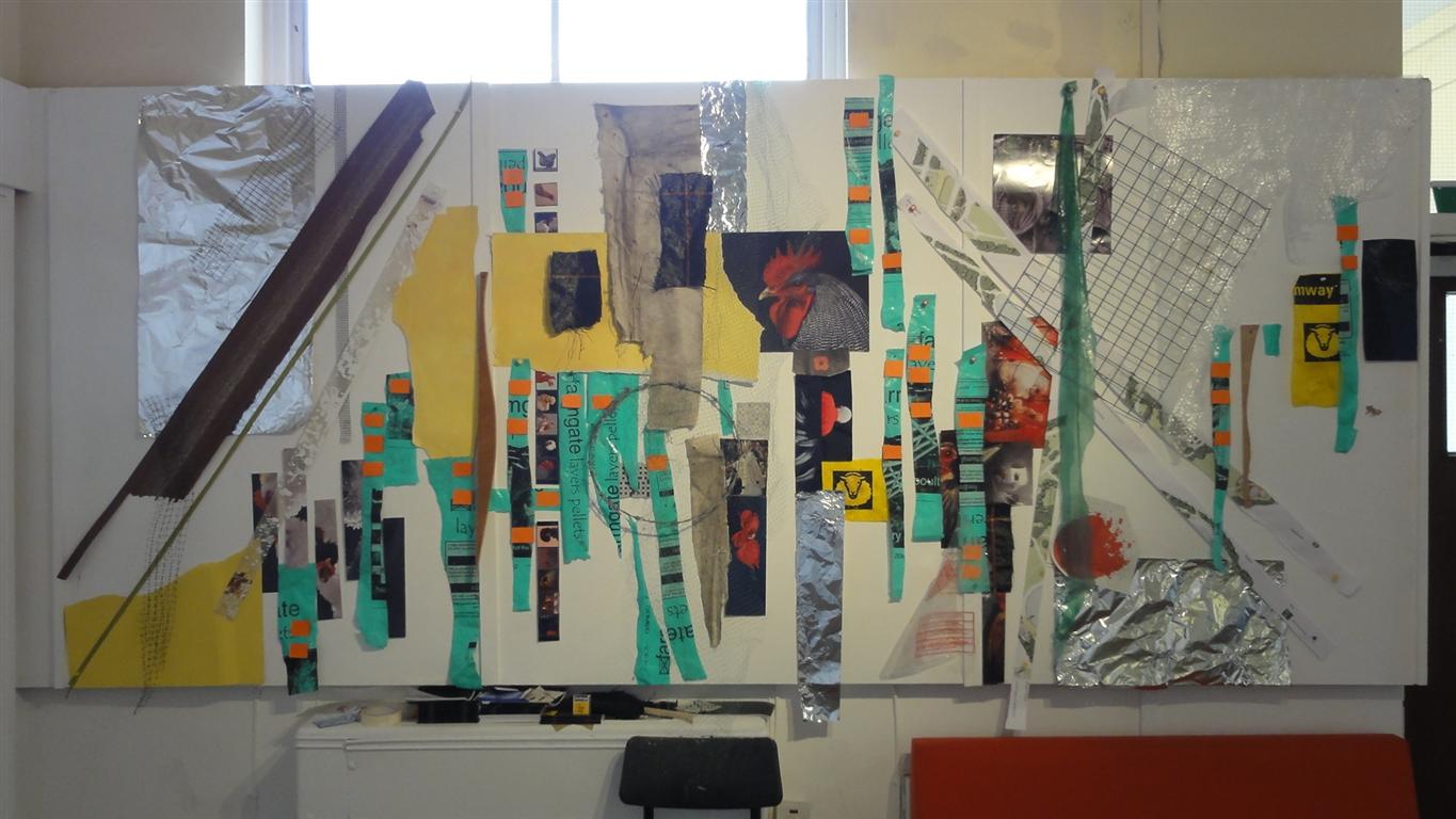
    Second wall piece
    Gather source material- negatives / plans (A1) from TGP office and various items from home , particularly grids / netting.
    Experiment with dribbling / flicking white emulsion on brown A1 neg.which provides swirling patterns reminiscent of constellations. A way forward of contrasting these essenetially random patterns with the disciplines of grids / squares suggests itself. Also happen  upon striking image of the 'Haj' - essentially iron filing around a magnet by the artist XXXX. Magnetic forces / cosmic forces - something is developing..... 
    Initially have difficulty integrating this image - set it on left of compositon ( ten to twelve). Eventually realise that it has to be moved centrally as it such a commanding, concentric image.
    Find piece of black nylon netting which chimes well with scale of Haj image rigid grids- 'warped in space - black holes?
    Dialogue between ideas and materials is fascinating - I guess if these ever fused into a balanced /exciting compositon that would constitute a successful work.

    Third wall piece
    VB discussion suggests more at bigger scale and moving into communal  space by Steve's office!
    Now hunt is on for more material. 
    Agricultural feed bags in bright clours and calendar showing great images of rare breed hens provide a promising start.
    Gradual build up - establlish some diagonals to work against the horizontal / vertical  axis of photographic images.
    Bigger space is helpful in viewing work as it progresses.
    Integrate images of Pope /sheep /barbed wire - not too subtle perhaps but there is something to say about our relationship to animals.                            


    .


    Wednesday 26 October 2011

    Ralf Broeg, Artist's Talk - 25/10/2011

    German, based in Dusseldorf. Currently teaching sculpture (4 days in a month) at Sunderland.

    Stimulating talk, good timing as I have seen much 'contemporary art' recently which I felt had little to offer me, despite working quite hard at it!
    •   crosses a range of disciplines -sculpture, graphic design, silk screen, painting and probably more
    •   often works in collaboration- composers. cabinet makers, electricians....
    •   site specific work and free standing works
    Sculptures in glass, perspex, wood, metal. Very strong spatial sense, much work has 'Bauhaus' austerity.
    Kinetic qualities explored with moving elements, rotating forms etc.

    Interestingly painted/ manipulated gallery floor to strengthen relationship of two paintings placed at right angles to one  another.

    His 'Fuzzy logic' series were exciting - often referenced from well known paintings Monet, Goya...
    Executed through series of dots of differing size and densities -computer generated prior to silkscreen printing. Great sysnthesis of digital and analogue work, referencing well known paintings but providing a totally new statement. The discipline of the underlying grid coupled with apparently random dots/ fine aethetic judgements provides the basis for powerful, stuctured work.

    Tremendous energy, competence coupled with aesthetic judgement - one to watch.

    What to do?

     Thinking around current work on Isla del Sol sketch
    • VB comment -working at too large a scale, work out palette at smaller scale/ collage bits etc.
    Contemplating this at 5.0 am having delivered granddaughter her bottle...trying to articulate what I  am aiming for (prerequisite for aiming it would seem, otherwise aimless??)

    landscape concerns
    • landform, particularly related to erosion and influence of man
    • settlement patterns influenced by topography/climate
    • landscape as a serial viewing experience / passage of time (seconds/seasonal/geological/memory)
    Figurative / Abstract
    Abstraction as a means of accentuating character
    1. degree of abstraction- should retain some demonstrable link with source landscape
    2. colour and its role in defining / creating space
    3. importance of 'intention'
    Intestingly Chris Jenks, in Visual Culture, argues that 'abstraction' can be regarded as a perspectival issue, that it is concerned with altering the size and relative prominence of aspects of phenomena in relation to their original place. Essentially traditional perspective is a form of abstaction- it simplifies the relationship between the eye, brain and object.


      Tuesday 25 October 2011

      Move over

      Move over
      Another soul on the planet.
      Friday 7th Oct at 0330 hrs. Reuben, Jerome, Veitch, weighing in at 7lbs and 13oz- a son for Ruth and Robert.
      A hard won delivery but both mother and baby doing well ( father still in shock!). Even as a grandfather it is still  an exraordinary experience and such a happy time when things eventually work out.

      Anthony Faroux Durham Cathedral Artist in Residence (16/10/2011)

      Exhibition at DLI museum Durham City

      Interested to view having heard him speak  to student's at Sunderland.

      Exhibiton has an interesting take on " a preoccupation with movement and stillness in lanscape" The exhibits comprised a video and related paintings.

      Video shot in mountain landscape and cuts between trees, moving water, fog and wider landscape shots.
      The mist is effective in cloaking and then revealing landscape elements. The sound track is just as important with passages of stillness contrasted with the sound of moving water /wind etc.

      Liked the idea of related painings but  felt that  most failed to provide sufficient resonance with the video and were not, in themselves, sufficiently good to stand alone.

      On balance felt the work showed great sensitivity to landscape and atmosphere/mood.

      Monday 24 October 2011

      Studio 1- progress

      Hard business getting back in after travelling- too many ideas.
      However, need to commit and see what happens...

      Working up landscape from sketch made on Isla del Sol, lake Titicaca.

      Field Sketch


      1) First painting attempting to convey something of the heat and space experienced - result too literal, pinks not that warm.    


      2) Second attempt more fluid and tighter palette


      Considering version 3 to be more abstract. Discuss with VB who suggests experimenting with collage. Produce own coloured sheets as basis for collage palette.
      Also referencing back to Robbledio painting from Extramadura -interst in relationship of development to topography. Links to south America as many of the conquistador footsoldiers came from Extramadura which, then as now was one of the poorest areas in Spain
      Collage picks up on village form, derived from Robbledio sketch, to some degree. Discussion with JH suggests looser approach addressing colours/ shapes/ space without referencee to anything else.


      Sketch / painting/ photo
      as source material


       Collage process quite liberating

      First collage using painted sheets, then cut/ torn
      to provide largely random shapes


      Attempt to express central spine of village

      Friday 21 October 2011

      The Sixteen- 14 /10/2011

      Performance in Durham Cathedral by The Sixteen, conducted by Harry Christophers.

      Programme devoted to Marian works by Victoria -( late C16 Spanish ,with stint in Rome) Contemporary of El Greco, though not known if they ever met- almost certainly new of each others work.
      Top quality performance that you can just relax into.
      Attempt to viualise in terms of colour/ pattern. Cathedral provides large, symbolic space. Dark shadows and recesses contrasted with warm yellow light. Backdrop to well saturated colours?

      Struggle to visualise as a painting
      • Perhaps best as crayon drawing on dark,warm, neutral paper. Polyphony provides a series of clear pulses of sound, high notes soaring way up into the mysterious darknness.
      • Rich, saturated lower notes/ colours, lightening as they ascend

      Frieze experience 13/10/2011

      Train trip down, attempting to get into 'Visual Culture' edited by Chris Jenks- some quite interesting observations about dominance of  interpreting the world through visual means (See what I mean? What is your view?). Part of his argument is that this somewhat formulaic approach dulls our perception.

      Coffee at St Pancras, now a wonderful space to be in -a few minutes refuge behind the Americano, playing the voyeur to the London tableau.

      Regents Park- ( Frieze - 173 galleris  from 33 countries)
      Great venue and setting for the sculptures
      •  Will Ryman's huge red flower hits you in the eye but does little else
      • Circular piece of metalic,silver dancers, obviously referencing Matisse but without his sense of joy- what is dance without joy??
      • Gavin Turk's 'Ajar' - door and frame set in the grass- an invitation to a new experience, I hope so?
      Approaching the tent and queuing with a heightened sense of anticipation.
      I try to open my mind, but as someone who has strong interest in painting beyong pattern making.......

      What is fascinating is the variety of what is on offer:
      • Works with homour, 'ready made' etc. How far can this be taken? E.g. Claire Fontaine's work- a neon sign spelling out " This neon sign was made by Vladimir Rustinov for the remuneration of one hundred and sixty thousand rubles"....The Artist's intention fabricated by a specialist.. once this point is made what else is there? It is not particularly pleasing to look at- if I look at  it tomorrow would it tell me anything else? If not why would I wish to purchase /own??
      • The ultimate 'Ready made' .Christian  Jankowski's boat - bought for £65m, but selling it as ,art for £70m. Options:
      1. Tophy for the super rich / super gullible
      2. Emperor's clothes
      3. Art
                My great fear is that Sunderland may educate me to see this as ART!

        • Scott King's poster entitled "Marxist disco cancelled" brought a smile and a train of thought- perhaps its done its job? How much should you look for in a work of art?
        Some of the works which caught my eye............


          Interesting that some of the 'big names' on show seem to have big names for a good reason- their works are good! e.g. Tacita Dean, Richard Long, Richter....


          Richard Long
          Tacita Dean
          Gerhard Richter
                                                                                             
          Antidote to Modern Art

          Called in at British Library en route to KingsX
          Viewed Jain Sacred Texts - low light levels, few people,quiet, imtimate, contemplative.
          Multiple, small, semi abstract images - reds and golds. They appear rich, full of life, with evident skill in their execution and despite being from a different culture, speak directly. Not something I found much at the Frieze!

          Wednesday 5 October 2011

          View from the hill- First entry from a Novitiate

          Greetings 
          The ceremony was so low key, no blood, no promises of loyalty or devotion, just some images on a screen and the clicking of a mouse - yet it is daunting, will I learn to love/hate/ignore/obsess over?
          Pixel power is perplexing for a mind nurtured on pencil, ink, paper. I miss the response of the mark making, the forgiving nature of the paper, the blot, the crossing out, folding it and putting it in my pocket... Now my electronic umbilical stretches out across space to deep wells of knowledge undreamt of and remaining just out of reach until I have mastered the cool logic of command and execution.