1. INTRODUCTION
2. BIBLIOGRAPHY
2. Bibliography
3. Gallery Visits
4. Grid Possibilities - selection of contemporary
artists utilising Grids
5. The Nature of Painitng - notes on the development
of a personal language
6. Artists of Influence
2. BIBLIOGRAPHY
Listed below
are key sources consulted in some depth during this module. Numerous further
sources of information have been consulted - other books, periodicals (hard
copy and online), artists’ websites etc.
Contemporary Art: A Very Short Introduction – Julian
Stallibrass, Oxford University Press.
Art Theory:
A Very Short Introduction – Cynthia Freeland, Oxford University Press.
Modernism: A Very Short Introduction –
Christopher Butler, Oxford University Press.
Post Modernism:
A Very Short Introduction - Christopher Butler Oxford University Press
The
above 'Very Short Introductiuons' have been useful in providing an
overview which includes other artistic disciplines including literature,
music,theatre and architecure amonst others. I think it important to
try and understand that the visual arts do not inhabit a discrete space.
I believe there are particularly strong links with the world of music
-this is borne out by much of the terminology used.
Sociology and Visual Representation – Elizabeth Chaplin, Routledge,
London and New York
Global Visions: Towards a New Internationalism in the
Visual Arts – Jean Fisher, Kala
Press in association with The Institute of visual Arts, London.
Press in association with The Institute of visual Arts, London.
Essays on Art & Language – Charles Harrison, Basil Blackwell
Ltd, Oxford.
Balance: Art and Nature – John K Grande, Black Rose Books,
London
The art of twentieth century Zen: paintings and calligraphy by
Japanese masters – Seo, Audrey Yoshiko, Boston Mass, London: Shambhala 2000
Art & Time Exhibition Review – Michel Baudson,
Barbican Art Gallery, London
Itten: The Art of Color – translated by Ernst van Haagen,
Rheinhold Publishing Corporation, New York 1961.
Painting after Pollock – Sigel, Jeanne, Amsterdam, G&B
Arts International, 1999.
Minimal Art: A Critical Anthology- Ed George Battock,
University of California Press, Berkley and Los Angeles
Pictures of Nothing: Abstract Art Since Pollock – Kirk
Varnedoe, A W Mellon Lectures in Fine Art 2003, Princeton University Press.
The Infinite Line: remaking art after modernism – Briony Fer, New Haven, Conneticut,
London & New York, Yale University Press 2004
Difference and Repetition – Gilles Deleuze, translated Paul
Patton, Continuum, London and New York 2001
Agnes Martin: Dia Art foundation – Cooke, Lynne,
Martin, Ages 1912-2004, Kelly, Karen - New Haven, Conneticut, London & New York,
Yale University Press 2004
Max Cole – Various interviews, Charta, Milan,
Italy 2000
Gerhard Richter: Panorama: A Retrospective, Tate Modern,
London, Tate Publishing, London.
Gerhard Richter: Essays – Martin Hentschel and Helmut
Friedel, Anthony d’Offay Gallery, London.
Mark Francis- Richard Dyer, James Peto and
Francis McKee, Durham City Art Gallery The Hugh Lane, Lund Humphries.
Mark Francis: Elements – Milton Keynes Gallery, Pale Green
Press, Milton Keynes
James Hugonin: ‘And our eyes scan Time’ an
exhibition of paintings by James Hugonin and Ian Stephenson by De La Warr
Pavilion in association with BALTIC Centre for Contemporary Art,2006.
Clement Greenberg: His critical and personal relationships with Jackson Pollock and selected post painterly abstractionsts- Jones, Janet Alice PhD New York University,1988
Modern Artand Modernism: A Critical Anthology- Ed Francis Frascina and Charles Harrison. OU Publication.
Bryond the Crisis in Art- Peter Fuller, Writers and Readers Cooperative Society, 1980
Theories of Modern Art:
A Source book by artists and Critics- Hershel B Chipp, Peter Selz and Joshua C Taylor, University of California
Press
Modern Art: A Critical
Introduction- Pam
Meecham, Julie Sheldon, RoutledgeVisual Thinking - Rudolf Arnheim, University of California Press 1969
3. GALLERY VISITS
Listed below are gallery visits with a brief note of some ‘Key Lessons/Observations’ of particular relevance to my current efforts to develop my practice and critical thinking.Hatton Gallery, Newcastle
Part of the 'As Slow as Possible' AV Festival :J Maire deconstructs time-based media such as video, film, slide projection and performance, exploring ideas of slow motion and duration. Extract from gallery handout:
" Making his own cineamatic machines using old technology, Maire reflects on illusion, memory and the passage of time. His modiffication of obsolete technologies works against the current rhetoric of technology as progress and promise. Consisting of unique prototypes, these original creations are too complex and delicate to ever be considered for mass production. They are slow in production, presentation and ethos."
Model for Apocalypse
Slow material developed by the artist (gallery attendant did not know what it was- however it is soft, granular and breaks down slowly when pressed into a shape.)
Interacting- forming rough constructions you can then watch your handiwork slowly disintegrating on screen. It is difficult to sense the scale of the on screen image - it can be read as quite grand - and hence thoughts of large scale erosion / larva flows/ geological procees of breakdown (our own 'self generated apoclaypse?)
Other works exploit:
- pixelated images and old photographs which have been adhered to a series of square section tubes which are selectively brought in and out of focus thus disintegrating and rebuilding the image- quietly absorbing.
- gradually slowing film speeds to reach a state of 'suspended animation'
- clearing and reprogramming obsolete memory chips through use of UV light
- high voltage photo's made via high voltage sparks in a blacked out environment, gradually revealing the form of a 3D object
- and more......

Interesting guy generating lots to think about and engage with (Relational art!)
Baltic - Oct 2012
Mark Wallinger
His work, Okerstein
2007, is particularly
apposite and relevant to my current exploration of grids, seriality and
repetition and shows how the ‘grid’ can still be a powerful tool in
contemporary art.
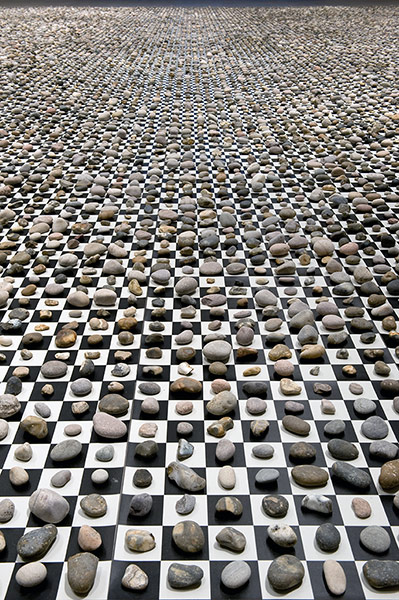
Individual
pebbles placed on a black and white grid- the simplest binary method of
creating order –structure contrasted with organic form... a giant checkerboard
of 65,536 stones a number which in mathematics represents a ‘super-perfect’
number. I like the combination of a fascinating visual result underpinned by
some rigorous thinking.
Quote from the exhibition handout-
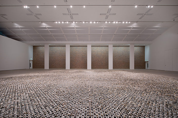
Quote from the exhibition handout-

Detail of carefully cataloqued stones on 'chessboard ground'
Tate Liverpool - Sept 2012
Turner / Monet /
Twombly
Particularly
striking referencing of Turner in Twombly’s work –shows the continuing
relevance of proven painters from another age. The
common cause of much of these three artists work makes for informative
comparisons, separated by time and society there is an extraordonary
affinity between some of the works - particularly Turner and Twombly.


Plenty to ponder - tne enduring appeal of the 'sublime' landscape, the role of classical allusion and allegory in an audienced increasingly disatanced from 'the classics'. It is instructive to note how many highly rated, recent and contemporary artists refer back to well esablished and often 'universal' themes.
It
was a reminder of just how radical was Turner's move towards
abstraction. This was neatly highlighted at the time by William Hazlitt
who quotes one dyspeptic viewer of Turner's work " Pictures of nothing'
the viewer harrumphed,'and very like'". Possibly one of the better
definitions of abstract art!
Turner
lived at time when there had been much debate on the nature of the
English landscape garden and by extension aesthetics, through the
writings of such as Addison and Pope.
Interestingly Turner's work picks up on changing aesthetic appreciation of landscape the 'Picturesque's
style as evidenced by Claude Lorraine and the late 'Pastoral' as
typified by Constable was being challenged by Edmund Burke's notion of
'The Sublime' which fostered an interest in wild and challenging
lanscape which had hitherto been shunned.

Literature
has also influenced many of these paintings, both Turner and Twombly
basing works on the classic tale of Hero and Leandro. Twombly going as
far as integrating elements of text into the work.
Plenty to ponder - tne enduring appeal of the 'sublime' landscape, the role of classical allusion and allegory in an audienced increasingly disatanced from 'the classics'. It is instructive to note how many highly rated, recent and contemporary artists refer back to well esablished and often 'universal' themes.
Twombly’s Quattro
Stagioni 1993 -5 indicates
how ‘classic subjects’ such as the four seasons can be reinterpreted and made
relevant to a contemporary audience. Seriality and cycles in evidence again.
Theatre Royal (Dec 2012)
Rambert Dance Company
Three very different works;
Contribution of visual components very interesting:
Theatre Royal (Dec 2012)
Rambert Dance Company
Three very different works;
Contribution of visual components very interesting:
- costume - largely played down as is common today - black, white, taupe etc. Middle set of dances the exception with evocations of childhood aided by wider colour palette.
- Lighting vital element in all the works, very effective warm light on moving figures against cool, minimalist background in final piece.
- As ever the tension betwen moving bodies and the score proved central to the expeience. Effectiveness of some of the 'stiller moments' when the choreography was not 'trying too hard' proved most telling. Must be parallels here for painting work.....
Baltic - (Dec 2102)
Jim Shaw
Extraordinary
breadth of art attempted – moral ‘don’t be afraid to explore different
approaches’- cross fertilisation etc...
American artist - late 1970s graduate fronm California Institute of the Arts
Use of old theatrical drops- scale creates stunning impact but his integration of the original ‘theatrical design’ as part of the narrative of his finished work is particularly interesting. Most striking images - huge scale paintings using old scenic drops - usually integrating existing 'theatre' material without painting out and repriming.
Much of his work is political and reLates to American culture.
See below his take on the 2004 Bush election where he subverts the American flag - using president's heads as the 'stars' and red cornsnakes as the 'stripes'.

Perhaps the lesson for aspiring artists is to keep experimenting and pushing the boundaries?
- Works in many different styles /media Painting /drawing /graphics/ video / music+ dance colaboration
- Wary of the trap of developing a 'signature style'
- Hugely prolific
Use of old theatrical drops- scale creates stunning impact but his integration of the original ‘theatrical design’ as part of the narrative of his finished work is particularly interesting. Most striking images - huge scale paintings using old scenic drops - usually integrating existing 'theatre' material without painting out and repriming.
Much of his work is political and reLates to American culture.
See below his take on the 2004 Bush election where he subverts the American flag - using president's heads as the 'stars' and red cornsnakes as the 'stripes'.

Perhaps the lesson for aspiring artists is to keep experimenting and pushing the boundaries?
DLI, Durham - Dec 2012
An Experiment in Total Environment- Toby Patterson and Victor Pasmore
The
exhibition stemmed from Toby Patterson’s long term fascination with Pasmore’s work,
particularly his Apollo Pavilion which spawned a number of pieces which are
juxtaposed with some of Pasmore’s work.
Of
particular interest is Pasmore’s use of painting and two dimensional designs to
help resolve three dimensional (essential urban /landscape design) problems.
'I transferred many of my spatial problems raised in Urban design to the process of painting so the two activities became reciprocal. Then afterwards, as my painting changed and became more fluid,\and linear, so the change was transferred to the process of layout at Peterlee, which in turn became fluid and linear'
'I transferred many of my spatial problems raised in Urban design to the process of painting so the two activities became reciprocal. Then afterwards, as my painting changed and became more fluid,\and linear, so the change was transferred to the process of layout at Peterlee, which in turn became fluid and linear'
Why should
my interest in early music- plainsong/ polyphony etc not help resolve problems with
developing a painting (links Hugonin whose work is often described in musical
terms)?


Both images above - Toby Paterson
 Image opposite - Sculpture by Victor Pasmore


Both images above - Toby Paterson

Below - Realtime image by John Topping

Gallery 3
illuminating a virtual model of Victor Pasmore’s Apollo Pavilion by
mapping the relative position of the sun as it passes over the actual pavilion
located in Peterlee 12 miles to the east, realtimelapse confronts us with a
representation which sets out to question how we decipher “reality” and
construct meaning and truth.
The very singular precision and elaborateness of this representation, is
however, precisely that which undermines its sense of reality. In this sense
the work stands almost as a parable of the commonly perceived viewpoint from
which Modernist architecture has popularly been represented.
John Topping
Virtual
model of Apollo Pavilion directionally lit and filmed to represent a 12 hour
cycle- setting out to question how we decipher ‘reality’ and construct meaning
and truth – neatly taps into my current interest in ‘the ephemeral nature of
landscape experience’
NGCA Sunderland - Dec 2012
Moral Holiday
Range of
artists, largely exploring the issue of mortality/ immortality demonstrating
that this ancient artistic preoccupation still has ‘legs’!
Baltic - (March 25th 2013)
Fabrice Hyber
Work characterised by experimentation and exploration. Continually evolving practice including painting, drawing and installation. Describes his work as being developed from a 'principle of echoes' in which, in which each work is made in response to another.Keen on audience prticipation in many works - ' a work of art is the begining of a sntence that is not completed ' without the audience.
Drawing is very important to Hyber's practice - a point of departure from which other owrks, including painting, sculpture and installation emerge. ' More complex than a film about my works, storyboards have become crucial for describing all the ramifications of my thinking'.

Fabrice Hyber- Storyboards at the Baltic

Fabrice Hyber - 'Un metre de cube de beaute'
A one metre cube covered in lipstick- worked woth Yves Saint Laurent in the production of sculptures, demonstating one of the fundamental principles of his work- the permiability between the worlds of art, business and scince.
His interest in 'transformation' is further evidenced by his collaboration with a professor at Massachusetts Institute of Technology- jointly exploring the influence of environment the environment of the environment on the stem cells of the humand body.

Fabrice Hyber -work relating to to the environment and nutrition
Part of this work evokes the importance of transformation: the transition of food into sustenance and of stem cells into different cells.
Key points of interest / relevance to my practice
use of charcoal / storyboards to work up / explain ideas
positive relationship to other areas of life
his 'principle of echoes' - one work made in repsonse to another
Tate Modern
LICHTENSTEIN: A Retrospective (May 2013)
His iconic painting 'Wham'
It is interesting to see the original comic strip which inspired this work and how significantly he altered the originl image to make a painting.The exhibition was much more varied and exciting than expected with a great concern with and understanding of the technical aspects of painting. Powerful use of limited palette with great subtlety introduced into his main chosen vehicle, the Benday dot. Right at the end of his life he produced some stunning and subtle landscape paintings inspired by traditionl Chinese scroll paintings.
Extract of Observer Review (emphasis/underline mine)
These images are so striking as to exceed, by far, their nominal subject; which is not so much the objects themselves as their commercial depiction. But it comes to the same thing in Lichtenstein's work. He is always pondering the great conundrum of painting: how to represent in two dimensions on a flat canvas what can be seen and experienced in the three-dimensional world.
And the result is sometimes so succinct it amounts to a form of prose poetry. The sight and sound of an Alka-Seltzer swooping down through a glass of water is perfectly expressed in the trail of blank bubbles fizzing behind the disc and the spume of white dots scintillating among the black ones upon the surface.
What it brings into focus is Lichtenstein's fascination with the DNA of painting: the stroke, mark and dot of the brush. How to render polished surfaces using liquid swipes, and Bakelite hardness with stipples; how to create light and air with screens of dots that openly declare their own artificiality.

Bedroom with Water Lilies
Not discernible in this image is his use of colour- the small pot on the left side bedroom table is a stunning deep cadmium orange in a picture otherwise composed of controlled blues, yellow and green. This is crucial in the colour field dynamic...Lichtenstein died unexpectedly in 1997, at the age of 73, so one cannot say that these semi-abstract landscapes were made as last works. But the faithful old dots are given a new life here, finely graded from misty grey to glowing white to evoke sea, sky and snow like a Chinese watercolour. A tiny Lichtenstein boat edges into one of these visions, voyaging into the light.

Landscape with Philosopher
One of his last paintings
Barbican
The Bride and the Bachelors (May 2013)
Duchamp with Cage, Cunningham, Rauschenberg and Johns
This exhibition explores a sea-change in post-war American sculpture, painting, dance and music; and examines one of its main sources of origin. It tells of the love, friendship and play of influence between two artists, a composer and a choreographer, and of their mutual respect for a key figure of the European avant-garde: the father of Conceptual art, Marcel Duchamp.
Particularly interesting set of cross fertilisations. For example Robert Rauschenburg's series of all-white paintings made from household paint with a roller tpo provide a smooth 'blank' canvas surfaces were instrumental for John Cage. hese paintings invite the play of ambient atmosphere, becoming in Cage's words 'airports for the lights, shadows and particles. In 1952 Cage translated the concept into music in 4"33" where the pianist does not touch the keys but the audience are invited to listen instead to the chance arrangement of sounds in the environment.

One of a series of Rauschenbergs 'all white' paintings
" It is a musical equivalent to Fountain, in that it “nominates” ordinary, humdrum noise as art. The point of 4’ 33’’ is not that it is silent, but that it pleads for focussed contemplation of the circumambient noise of the world: people coughing, a bus passing by, a distant siren..."

Merce Cunningham inspired dancers against a backdrop by Rauschenberg, in turn influenced by Duchamp's first 'Readymade' of bicycle mounted on a chair and Jasper John's flags.
Gagosian Gallery
Rachel Whiteread: Detached Exhibition
Extract from Telegraph review- (my emphases)That Whiteread is detached from both developments in recent British art is central to my understanding of what she does. On the one hand her work has a strong formal dimension – a concern for materials, process, texture, shape, scale and colour that you don’t find in the work of artists who make their own lives and personalities the subject of their art. But on the other hand, her casts of architectural spaces or ordinary objects of domestic use are anything but abstract and often come freighted with meaning.
Which is one of several reasons why the title of her show of new work at Gagosian –
Detached – is so apt. As Marcel Duchamp first showed with his readymades, to detach an ordinary object from its utilitarian purpose is to reveal its formal abstract qualities. This is exactly what Whiteread does when she removes doors, windows, bathtubs and sinks from their original context and primary function, casts them in concrete, plaster or resin, and exhibits them in an art gallery.
(Neat link with the Barbican exhibition above and the pervading nature of Duchamp's work)

Above - Gallery setting
Below - al fresco
I prefer the landscape setting belowwhich seems to invite a richer reflection on meaning, memory and context. They appear to the minimalist/ pared down streek in me- I see something which perhaps Agnes Martin might have wished to contemplate
4. GRID POSSIBLITIIES
Research into use and type of grids in the practice of contmeporary artistsGrids form part of many current artist's practice, three approaches used by contemporary artists are considered below as a potential for develping my own practice. Grids used as:
- focus of the work
- aid to comment on social / physical environment
- framework for abstract statement
1. Grid as central focus of work
Esther Stocker ( b.1974, Italy)
Works almost exclusively in monochrome producing works in two dimensions as paintings and 3D as 'rooms' or constructions/installations.2D work

Painting using broken grid creates tension within
the composition

Subtle progression within the grid as basis for composition
3D Rooms

Fragmemted grid requiring engagement
by the viewer to try and make sense
of the space

Fragmented grids creating disorienting
space
Comment - possible usefulness in developing current practice
- Fragmented grids - great potential
2. Grid as aid to comment on social / physical environment
Sarah Morris (b.1967)- studied Semiotics and Political Philosophy
- works cocrned with decoding the built environment
- works with painting and film making, one informing the other

Work entitled 'City Neon'. Abstract yet with clear reference to city environment

Untitled abstract introducing pattern which can be read as three dimemsional
space
Comment - possible usefulness in developing current practice
- Potential to make comment on natural environment, integrating loose washes
- 3D possibility within landscape context
3. Grid as framework for abstract painting
James Hugonin (b.1950)
- Northumberland based, strong landscape affinity metiulous work using formal grid
- (lines alternately 3mm and 2mm apart, horizontally and vertically)
- Observations by Chris Yetton ‘Grids in general are used to organise information. They are structuring devices. A grid is usually a matrix of knowledge. Information, often abstracted from some narrative is displayed spatially. Grids spatialise the temporal. But they allow a multiple series of new narratives to be read along a number of paths within them...... Hugonin’s grid is a static arena although gently animated by complementary underpainting. On it he places a large number of marks, individually singular in nature, one colour, tone etc. But the viewer’s eye does not rest on the spatially determined array of colours. The eye constantly moves through the painting. The static, spatial nature of the painting is, at the same time, dynamic and temporal'.


Subtle rhythmic patterns resulting from a disciplined approach - regular grid, gaps between grids painted alternately pale blue/green and pale ornage/red- a pair of complementary colours
- CHRIS YETTON ON THE PROPERTIES OF GRIDS
Comment - possible usefulness in developing current practice'THE ABSTRACT IDEAL and the sensual world Chris Yetton 2005'‘Grids in general are used to organise information. They are structuring devices. A grid is usually a matrix of knowledge. Information, often abstracted from some narrative is displayed spatially. Grids spatialise the temporal. But they allow a multiple series of new narratives to be read along a number of paths within them...... Hugonin’s grid is a static arena although gently animated by complementary underpainting. On it he places a large number of marks, individually singular in nature, one colour, tone etc. But the viewer’s eye does not rest on the spatially determined array of colours. The eye constantly moves through the painting. The static, spatial nature of the painting is, at the same time, dynamic and temporal.
- like his quiet cerebral approach and subtle transcendent end product but down side is incredibly slow, laborious process taking place over months if not years
- like the idea of tension generated by something much looser working against the grid which is not Hugonin's style.
Grids and Beyond - Gerhard Richter
Gerhard Richter is an exemplar of extreme versatility and prodigious output

Enamel on canvas- titled 1024 Colour
Richter employs the simplest of grids to allow exploration of colour relationships

Untitled abstract (280 x 200 cm)
With one bound he is free! Using his trademark 'blur' he produces a stunning exploration of space and colour with a strong landscape feel
5. THE NATURE OF PAINTING
Thoughts on Developing a Personal Language
“The artist must understand the past in order to define a new problem and proceed to innovation” (Greenberg)Janet Jones in her book: Clement Greenberg: His critical and personal relationships with Jackson Pollock and selected post painterly abstractionists provides useful insights into this seminal critic’s work.
Greenberg provides a useful summary of the radical shift which took place with the advent of Modernism " From Giotto to Courbet, the painters first task has been to hollow out an illusion of three dimensional space on a flat surface. One looked at this surface as though through a proscenuium arch into a stage. Modernism has rendered this stage shallower until now its backdrop has become the same as its curtain, which has now become all the painter has left to work on.
..." the picture has become an entity belonging to the same order of space as our bodies, it is no longer the vehicle of an imagined equivalent of that order Pictotial space has lost its "inside" and become all "outside". The spectator cna no longer escape into it from the space in which he himself stands. If it deceives his eyes at all,it is by optocal rather than pictorial means: by relationd of color and shape largely divorced from descriptive connotations, and often by manipulations in which top and bottom , as well as foreground and background become interchangeable
He reflects on the vacuum in popular appreciation... "This spatial illusion , or rather the sense of it is what we may miss even more than we do the images that used to fill it "
On representation in art (Clive Bell – The Aesthetic Hypothesis)
'Let no one imagine that representation is bad in itself, a realistic form may be as significant, in its place as part of the design, as an abstract. But if representative form has a value, it is as form, not representation. The representative element of a work of art may or may not be harmful; always it is irrelevant'
Janet Jones summarises Clement Greenberg's (CG’s) theories of art and criticism ...’he sees art as having evolved in a linear and dialectical progression of styles that increasingly move towards”purity”
By rejecting the conventions of tactility, value contrasts and closed composition CG considers ‘the irreducible essence of pictorial art ....This essence consists of two conventions “flatness and the delimitation of flatness”
This, to me, seems to reduce contemporary painting to an introverted quest upon itself and find comfort in some of Peter Fuller’s views (Beyond the Crisis in Art) ‘I believe that his (CG’s) diminution of the importance of the imaginative, material processes of expression was a significant fact in the reduction of art towards ideology’’
Pictorial Laws - Hans Hofmann
Painting posseses fundamental laws. These laws are dictated by fundamental perceptions. One of these perceptions is: the essence of the picture is the picture plane. The essence of the picture plane is its two - dimensionality. The first law is the then derived : the picture plane must preserve its two-dimensionality throughout the whole process of creation until it reaches its final transformation in the completed picture. This leads to the second law: the picture must acheive a three dimensional effect, distinct from illusion, by means of the creative process. These two laws apply both to color and form......The act of creation agitates the picture plane, but if the two dimensionality is lost the picture reveals holes and the result is not pictorial, but a naturalistic image of nature.On CG’s approach to the avant-garde...the right degree of ‘surprise’ is required to develop a painting....”new surprises constantly expand and revise expectations. To create surprise, previous styles must be used as the norm since it is only through comparison that the surprise will result in a true aesthetic experience...
“The artist must understand the past in order to define a new problem and proceed to innovation” But the artist does not consciously decide to innovate. This innovation emerges from his struggle with conventions inherent in the old style. Superior art is produced when the artist which of the old conventions to discard and which, by retention, can further the innovation. Avant-garde art is then, both a reaction against, and an assimilation of the past”
(PV note- This rings true, however, it is this knowledge and set of value judgements which is particularly taxing for the student of Fine Art)
“When the element of surprise is excessive, expectation and surprise lose their connection and the viewer is unable to understand the work” (Caveat emptor!)
JJ posits that excessive surprise creates the superficial appearance of a work being avant-garde. Yet CG states ‘Only it now turns out not to be true that all startling work is necessarily innovative nor new art”CG produces a distinction between the genuine avant-garde and what he term avant-gardist which he terms ‘raw art’ which by ignoring all conventions removes itself from its historical lineage- it is therefore not part of his linear progression towards purity.
Size Matters
Selecting the right scale to work at is a complex business.
Clement Greenberg commenting on " American type painting" observes...' the Abstract
Expressionists were being compelled to do large canvasses by the fact that they had increasingly renounced an illusion of depth within which they could develop pictorial incident withiout crowding ; the flattening surfaces of their canvasses compelled them to move along the picture plane latteraly and seek ,in its sheer physical size,the space necessary for their kind of story'
Kirk Varnedoe quotes Agnes Martin on her decsion to use a 6ft square format " It's a size you can walk into....." but he adds that her decsion to adopt a standard format was also predicated on scale and the continual refinement of her means of expression.
Mark Rothko - scale is a major factor in the success of his disturbing, contemplative canvases.

Rothko at Tate Modern
The Idea as Driver (See main Blog 24th March)
At what level should the visual world and wider experiences influence a painting. Stuart Davis writing 'on the American scene' describes himself as an American painter and quotes an eclectic mix of influences...American wood and iron work of the past, skyline skyscraper architecure, the brilliant colors of gasoline stations, chainstore fronts and taxi cabs; fast travel, electric signs; the music of Bach, synthetic chemistry, 5 and 10 cent kitchen store utensils.; Earl Hines hot piano and negro jazz music.......etc In one way or another, the qulity of these things plays a role in determinig the character of my painting; not in the sene of describing them in graphic terms, but by pre-determining an analogous dyanamics in the design which becomes part of the American environment
The Beauty of Non- Objectivity (Hilla Rebay, writng in Art and Modernism:A Critcal Anthology)
There is no representation of objects, nor any meaning of subjects in these paintings of free invention called non-objective art. They represent a unique world of theory, as creations with a lawful organisation of colors, variation of forms, and rhythm of motif.
She draws parallels with music..
'Painting like music, has nothing to do with reproduction of nature, nor interpretation of intellectual meanings. Whoever is able to feel the beauty of colors and forms has nuderstood non objective painting.'
She argues that detailed knowledge of the principles and techniques employed is only necessary for those 'who want to use the fundamentals of creation to become creators of art themselves,..... Non-objective art has beauty and spirit combined.
Breath of Fresh Air
Peter Fuller in his 'Beyond the Crisis in Art provides a breath of fresh air in his debunking of much art of the 1970's thinking the sort of thoughts which a recent student of Fine Art might hesitate to express, I particularly like his dismissal of Gilbert and George as 'tedious poseurs'!
Feeling versus intellect ( Marsden Hartley- " Art- and the Personal Life 1928)
....I have greater faith that intellectual clarity is better and more entertainig than imaginative wisdom or emotional richness. I believe in the theoretical aspects of painting because I believe it produces better paintings,...."
"I have come to the conclusion that it is better to have two colours in right relation to each other than to have a vast confusion of emotional exhuberance..."
Accident and Experience
Francis Bacon in converstion with David Sylvester"... in my case all painting - and the older I get, the more it becomes so -is an accident. I foresee it and yet hardly ever carry it out as I foresee it, It transforms itself by the actual paint. I Don't in fact know very often what the paint will do, and it does many things which are very much better than I could make it do. Perhaps one could say it's not an accident, because it becomes a selective process what part of the accident to preserve....
This is the difficult bit for the student- just keep putting in the hours!
6. ARTISTS OF INFLUENCE
Some of my work last year was influenced by Sol LeWitt. During the vacation I carried out further reading, initially related to Minimalism. Those listed below are an eclectic mix of some of the artists whose work has found resonance with the development of my practiceIssues of particular interest:
The making of pictures/ sculptures that were not meant to have meaning.
Kirk Varnedoe in his book 'Pictures of Nothing' `quotes Judd " The dripped paint in most of Pollock's paintings is dripped paint It's that sensation, completely immediate and specific, and nothing modifies it" When Judd or Andre looked at Pollock's work, they did not see pure opticality, they saw house paint poured out of a can, with no mediation.What was thrilling and exciting in Pollock's paintings were the properties of paint as a material ; its relationship to gravity, the way it hit the canvas; its immediacy and physicality, without reference or metaphor.
This purist standpoint is of interest, not least as a liberator from the historical baggage of centuries of pictorial tradition.
However, I am seeking perhaps,' a middle way' which allows the pursuit of beauty or a tangible source grounded in observation. Agnes Martin provides a staging post. The critic Lynne Cooke places her work in the classic tradition and quotes Martin on her work" The function of artwork is the renewal of memories of moments of perfection" (a statement not possible from a true Minimalist).The use of a grid became the basis of much of Martin's work. The academic and critic Rosalind Krauss provides a succinct view of the efficacy of the grid...’the orthoganol grid is not only nonheirarchical, infinitely extendable, and non relational but also projected as if seen from no vantage point at all’ For a contemporary art scene where much effort is devoted to non figurative / representational work these attributes provide a rich seem to explore.
Max Cole employs similar restraint and control to Martin she explains her differing approach thus 'The paintings of Agnes Martin developed from a formal exploration through the grid, while mine came quite directly from the landscape of the Southwest.'
Crucially, her paintings have no borders and are defined by horizontal bands bled right to the edge. She even offers a' landscape title' - Sandspit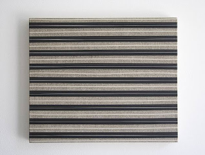 As Briony Fer argues in her seminal work ‘The Infinite Line’ the grid cannot be understood without reference to repetition and seriality. She talks of ‘the remaking of art through repetition in the wake of the exhaustion of the modernist aesthetic.’ She highlights the late 1950s as marking a shift from a ‘collage aesthetic to a serial one’.
Richard Dyer in his critique of the contemporary artist Mark Francis' ‘blur’ paintings (2003) speaks of ...The Invisible Grid “the organic elements of the paintings are perfectly counterpointed and balanced by the rigour of the grid that subtly weaves them into a tapestry of spatial tension’
Francis has a strong interest in human biology, structures and systems. Viewers may choose to pick up on this and read references to molecules,cells, synaptic structures or whatever. However, these are undoubtedly abstract works.
Briony Fer's comment ‘the remaking of art through repetition in the wake of the exhaustion of the modernist aesthetic underpinned by a shift from a ‘collage aesthetic to a serial one" offers an opportunity for exploration.
Crucial to this is the effect which repetition has upon the viewer. Gilles Deleuze in his book ' Difference and Repetition' quotes Hume " Repetition changes nothing in the object repeated, but does change something in the mind which contemplates it"
The philosopher Hume explains it thus ' AB, AB, AB, AB......Each objective sequence AB is independent of the other, the repetition changes nothing in the object or the state of affairs AB. On the other hand change is produced in the mind which contemplates it. A difference, something new in the mind. Whenever A appears, I expect the appearance of B.....Marta Marce (Spanish b. 1972)
Marta Marcé is a painter who studied an MA at the Royal College of Art (1998-2000). She has been showing her work internationally as well as in the UK.
Some of her work deals with colour, colour bands and stripes


Anselme Reyle
Anselm Reyle took an early interest in landscape design and music before finally homing in on painting and sculpture.[1] Characteristic of his work are various found objects that have been removed from their original function, altered visually and recontextualized. Reyle works in different media, utilizing strategies of painting, sculpture and installation and working in serial, structured work groups. The artist uses a vast and diverse group of materials taken from both traditional art and commercial milieus including colored foils from shop window displays, acrylic medium and pastes, automotive lacquer, and useless everyday garbage taken from urban areas. By removing these materials from their contexts and masking their original function, Reyle varies the degree to which each retains its respective visual reference. Utilizing formulas of appropriation the work lets the viewer shift between moments of identification of individual elements within the work, and periods of alienation due to their new context. Even the exhibition and work titles are very often citations from different fields, such as song texts; they function as objets-trouvés of the artist´s repertoire.
Reputation for 'foil paintings - innovative use of foil and perspex
 Dark background significant in increasing vibrancy of colours
Patrick Heron


Of interest because of his sheer joy in colour and his use of 'natural' subjects as source material as in 'Azaleas' on the right baove.
Degrees of abstraction v landscape character
Julian Opie
Extract from Lissom Gallery catalogue (underline emphasis mine!)
.....one of the most significant artists of his generation whose artistic preoccupation has investigated the idea of representation and the means by which images are perceived and understood. Throughout his practice, Opie has developed his own reductive formal language which seeks to reflect, not reality itself, but rather the way in which reality is represented: his distinctive language of discipline and formal consistency which is employed in his current portrait and landscape work.
Drawing from influences as diverse as billboard signs, classical portraiture and sculpture, to classical Japanese woodblock prints, Opie 'paints' using a variety of media and technologies which enable him to make three-dimensional explorations of his subjects.
Julian Opie's produces landscape which are abstracted yet the subject matter is clearly identifiable. Planes of consistent colour are produced as digital prints, laminated on glass and mounted on plexiglass.


Two images by Julian Opie's Winter Series, Alan Crista Gallery, London
Contemporary images by Opie, as he states above,..."seeks to reflect, not reality itself, but rather the way in which reality is represented" The resulting images provide a loose evocation of 'winter' which are slightly vacuous, which to be fair to Opie probably resonate with a public used to computer generated images.
For an acute comment on 'landscape character' go back a couple of generations and look at some of Paul Nash's work ( see below)
 Paul Nash: Beech Hanger
Although there is no record of the stated intentions of the artist this work comes across as a powerful comment on landscape character following detailed scrutiny/ analysis
David Hockney
Hockney is intresting in that his landscape paintings are generally readily recognisable as landscapes. However they range from sensitive statements on landscape 'character' and 'mood' to more markedly abstract works often employing colour palettes with heightened values which appear to be more about making exciting pictures then any statement about landscape character...

Hockney: subtle evocation of Yorkshire woodland in autum

Hockney: still Yorkshire but pushing the colour values

Hockney: California Bling!
Rebecca Salter


British artist who resonates with me
- pared down, contemplative reponse
- inspired by nature/ elements
- acknowledges debt to Agnes Martin
- largely monochrome
- very aware of texture/ pattern
Anna Mozynska Catalogue Introduction Beardsmore Gallery, London
What does it mean, in the 21st century, for a Western artist to borrow heavily from aesthetic traditions of the East? It’s a question that hovers around the career retrospective “Rebecca Salter: Into the Light of Things” at the Yale Center for British Art and the pendant show “Rebecca Salter and Japan” at the Yale University Art Gallery.Ms. Salter is a British artist who spent six years, in the late 1970s and early 1980s, in Kyoto, Japan, working first in ceramics before switching to two dimensions. Her canvases and works on paper — many objects here combine the two mediums — draw upon centuries-old traditions in ceramics, as well as Japanese calligraphy and woodblock prints. They also sync up, however, with Western abstraction, monochrome painting and midcentury Minimalism.
Nicholas Fox Weber Catalogue Introduction Howard Scott Gallery New York
| Rebecca Salter's recent work conveys as ever a quietness and repose that provides welcome respite to what she has expressively referred to as our 'digitally-rich and time-poor culture'. In the muted colour cadences and detailed surfaces there is encouragement to linger, absorb and to ponder difference. New materials (the use of aluminium as a support) and new techniques (involving the partial but deliberate rubbing out of the painted surface) are brought to bear creating subtle shifts and new departures from earlier practice. In essence however, the main shift in this body of work lies in its abstracted view of nature or of an emotion stemming from it, which is reflected upon late | ||||
Examples of her work:   | ||||
No comments:
Post a Comment