Saturday 15 December 2012

STUDIO PROGRESS


Studio Progress (11/12/12)

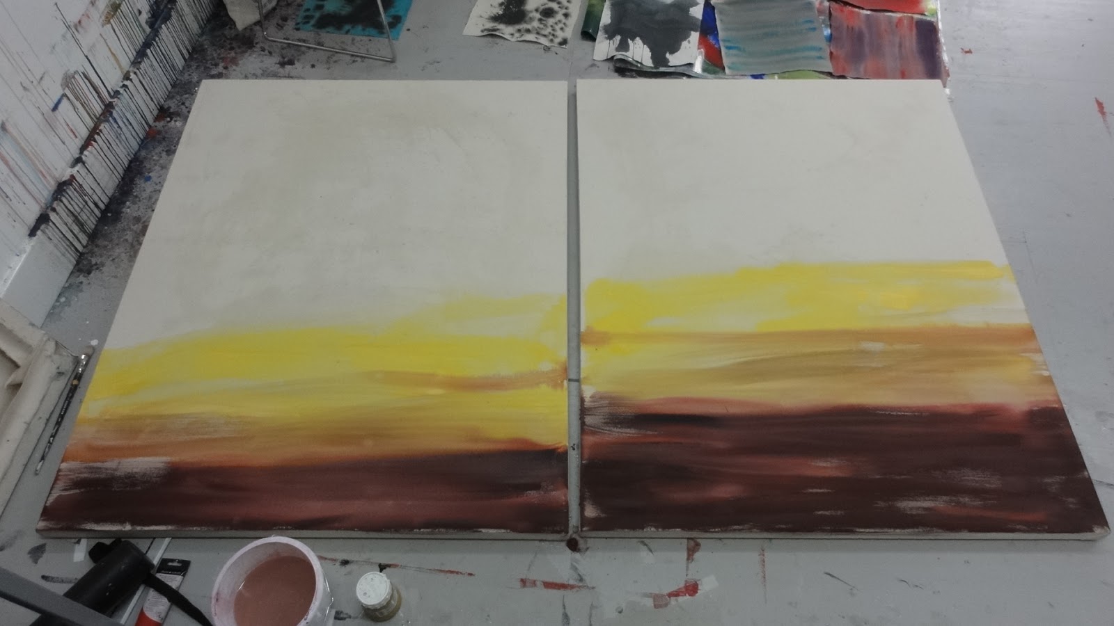
Further work on 'Mood' acryic wash paintings, sellectively intensifying colour..

Virginia Crit +
Discussed options for work:
  • Painted as diptych, therefore many options for relationship / orientation of the two 


  •   addition of grid / other  major intervention - there would be no turning back.   
Difficulty of introducung grids on unstretched canvas. Possibilty of weighting down but will inevitably distort canvas. 

New Work (reflecting on Traffic Lights Review)

  • Increase in scale  - possibility of using unstretched canvas straight from the roll 
Rolls come in 9ft widths. Can be mounted on 'carpet core' but not sufficient space in studio without being very antisocial!

Problem of when to introduce grid:

1) On raw canvas- likely to inhibit mark making.
    Painted on at the outset or masked out so that canvas remains. This would allow  possibilty of taking some later washes over the whole piece. 

2) After initial washes which would allow placing of grid in considered relationship with painting at this point.

Feel that appropriate grid should extend beyond the picture frame (Mondrian), rather than internalised grid (as much of Agnes Martin's work).


Consider 'homage to Mondrian',or at least covert reference!  Lift one of his grids and use as an underpainting.......

Mondrian acheived his goal of producing pictures that were pure abstraction and his journey through ever increasing levels of abstraction is well documented. Reducing everything to 'the picture plane' and a palette of primary colours' or monochrome is too controlled for my current purposes.


The challenge may,perhaps, be summarised as:
  • utilising a grid to imply activity beyond the confines of the canvas
  • using free washes with a sensation of 'space' without tipping into the representation of an overtly 'landscape space'


Thursday 13 December 2012

THINKING ALOUD


Thinking Aloud

Traffic Lights Review

Present:
Peter Wolland (PW)
Prof Eric Bainbridge(EB) 

Gave brief resume of journey through this module


“My current work explores degrees of abstraction as a means of analysing and commenting upon landscape character.  I am interested in how natural processes and manmade interventions have determined the landscape that we see. Of particular interest is the dynamic quality of landscape appreciation, how it changes from moment to moment through changing light patterns, diurnal and seasonal rhythms. This has lead to an interest in seriality and repetition.” 


( Please view previous Blogs as record of this journey)


There followed some useful discussion points:


At what point does a work become truly abstract, without reference to its source material?
Expressed concern about total loss of link with ‘landscape’ as a source/ inspiration

EB suggested that many major artists had achieved pure abstraction but underpinned by intellectual rigour throughout their artistic journey. He instanced Mondrian’s studies of trees.


PW put down the challenge as to what might lift my work into the magic 70+ territory!

Suggested that one option would be to greatly increase scale of work and ‘see what happens’ e.g. using section of 10ft canvas on a roll that could be transported.

Developments on this will be the subject of future blogs...........


Thursday 29 November 2012

EXPLORING ACRYLIC WASHES


Further work on acrylic washes using wet into wet.

Lining paper taped to board.
Linear mark derived from field patterns
850 x 450mm module


Further washes added to increase depth          

Introduction of charcoal 

Markmaking shows some influence from Barabara Rae

Charcoal band
Major charcoal band - marks too heavy compromising spatial recession if read as 'conventional' landscape space


Return to unprimed, stretched canvas 

Canvas   (1150x 800)well wetted but some difference in take up which makes for interesting effects which could be exploited in the futrure.

Build up of washes, treating two canvases as 'one piece'


Selective take up of red pigment due to uneven initial wetting of canvas.     

Gravity  used to take paigment down across canvas - limited control but some interesting effects


Orientation of canvas an issue                             


    Landscape format most interesting to date

Thursday 22 November 2012

MORE WORK ON WASHES

Issues:

Developing wet into wet
paintings (acrylic on paper).

Discussion with Lothar who reckoned that vertical format single brush expressions were little more than mark making and it is difficult to imbue much content.

However, experiment with more marks so that paint rather than 'space' dominated the ground.

Composition also an issue - often more effective to co-opt an actual structure rather than invent from a 'blank canvas'.

LG suggests trialing acrylic directly onto unprimed canvas. Also discuss with Virginia and it seems there are two schools of thought as to the most effective technique:
1) directly on to unstretched canvas laid horizontally
2) using very taught stretched canvas.

Initial trial using unstretched canvas


Canvas thoroughly wetted to ensure          uniform moisture content

Acrylic also fairly diluted to help acheive a 'suffused backgrround'


Initial results indicate unstable uptake of pigment where it is very difficult to predict / control the result.

Results left show continuing bleeding and loss pigment       colour.


Lower picture taken one hour after top picture


Two trial panels


 Shows limited and unpredictabe uptake of pigment


Monday 12 November 2012

SHAUN CRIT


    Shaun Crit

     Facilitated by Gary Powers / Eric Bainbridge

    Shown below are the two works submitted for discussion


    Key comments are listed below:

  • Interstingly the description from the floor read the above as one work and began to find linkages between the two.
  • In reality they were conceived and executed independently of one another. It apppears that the two were read as one piece largely due to their proximity. However, there was no further space on the gallery wall  to separate further the two works!
  • Lesson for hanging/ juxtaposition of work. 
     
    Left hand work
    pixelated - unintentional reference to 'computer' image generation
    abstract- yes!
    collage - yes, rectangles of pre coloured canvas arranged, tested and revised before glueing to board.  
Research influences- Agnes Martin and her subtle grids + her willingness to talk of 'beauty' showing much of the dsicipline of the minimalist approach but with ambition beyond a statement of materials and process.
Also Max Cole and her direct acknowledgement of a landscape influence whilst maintainig a highly  controlled abstract approach.

Relationship to 6 small paintings - some saw shapes in common and percieived  them    as more abstract than the large work (I find this difficult to follow!)


 Differing colour schemes noted- some saw this as some sort of code and others recognised a 'conversation' between the various elements (happy that people were sufficiently engaged to offer such coments !). Links with chromatology also dicussed.

Landscape connection- took some time for this link to be spotted/addressed. This probably should be a concern as landscape was the initial driving force behind this work. An impossible balancing act - producing a truly abstract work from a concrete source?

EB thought the surface of the large work dull and did not like the fact that all rectangles were not  entirely even. Also described the 6 small paintings as slick!
He also, correctly, identified Gerhard Richter as an influence.

Additional influence was Mark Francis with his subtle use of grids and blured imagery

More interestigly he posed the question as to when does a painting become truly 'abstract', independent of its source material.

Ref sequence below reading from left to right.


  • Some considered the 'green' version the most abstract and successful- however, I feel it to be one of the least abstract !
  • Reference to chinese writing/calligraphy
Really interesting process listeneing to others comments/observations, particularly linkages within the work which I had thought were relatively clear but not quickly picked up by the group and issues being brought forward which I had not considered or addressed....

My Statement of Intent declares one of my main objectives as 'Exploring degrees of Abstraction to comment on landscape character and appreciation'. Whatever the merit of the work the discussion, without prompting, did centre around the above objective, which is encouraging and a catalyst to further enquiry.


Friday 9 November 2012

UPLAND LANDSCAPE 2


Upland Landscape - further development

Revert to exploration of more abstract appproach, without totaly losing the 'landscape thread'
Series of further paintings (510 x 405mm) acrylic working into wet with brush and sponge.


Development of series is definitely helpful.
Regard something appraoching the pared down palette of the original painting to be more successful than the above.
 
  
Simplification by removal of straight line element produces more satisfactory image.

Virginia discussion

Interesting working in tandem with strictly controlled modular series (See Post 4th.Nov)
A lot to explore in terms of mark making, loading of brush/ sponge, underlying material etc.

Suggest using heavy duty lining paper and working wet into wet. 


Development plan
Some research into C20 Zen art
(The Art of C20 Zen- Paintings and Calligraphy by Japanese Masters, Audrey Yoshiko Seo with Stephen Addiss)
  • calligraphy an important reference point
  • Zen philosophy of distillation and meditation followed by swiftly executed ink line acheives much in terms of an expressive statement.


Experimenting 
1700grade lining paper, cut to rectangle based on a double square (often used Japanese proportions)- Dim's 1120x 560mm.
Paper taped to floor and well suturated by sponge with clear water .

Acrylic paint chosen and diluted sufficientrly to ensure good flow but retain density of line.
Payne's grey  chosen in preference to black as observation shows that  when appied very wet it partially settles out and there are hints if very dark blue and Naples yellow

Application - Mixture of Traditional Japasnese brush (tapered to long, fine point  and a traditional 'flat'.


Series produced from right to left (seems appropriate!)

 Most Japanese example employ a vertical ( portrait) emphasis and dominace of hwite ground over mark makng. Interesting too see what landscape format might produce.

Below version with dominance of ink over 'ground' in both vertical and horizontal formats


Below selection of work juxtaposed with last acrylic painting (central)


Some vigour and spatial ambiguity acheived in the simplest version below