Thursday 29 November 2012

EXPLORING ACRYLIC WASHES


Further work on acrylic washes using wet into wet.

Lining paper taped to board.
Linear mark derived from field patterns
850 x 450mm module


Further washes added to increase depth          

Introduction of charcoal 

Markmaking shows some influence from Barabara Rae

Charcoal band
Major charcoal band - marks too heavy compromising spatial recession if read as 'conventional' landscape space


Return to unprimed, stretched canvas 

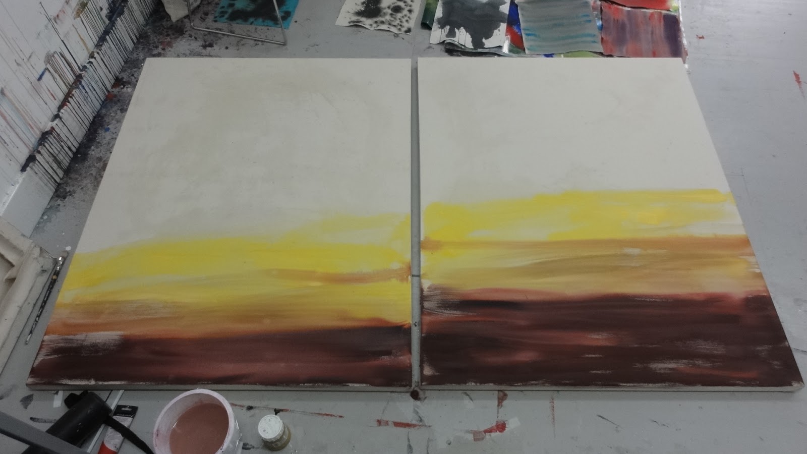
Canvas   (1150x 800)well wetted but some difference in take up which makes for interesting effects which could be exploited in the futrure.

Build up of washes, treating two canvases as 'one piece'


Selective take up of red pigment due to uneven initial wetting of canvas.     

Gravity  used to take paigment down across canvas - limited control but some interesting effects


Orientation of canvas an issue                             


    Landscape format most interesting to date

Thursday 22 November 2012

MORE WORK ON WASHES

Issues:

Developing wet into wet
paintings (acrylic on paper).

Discussion with Lothar who reckoned that vertical format single brush expressions were little more than mark making and it is difficult to imbue much content.

However, experiment with more marks so that paint rather than 'space' dominated the ground.

Composition also an issue - often more effective to co-opt an actual structure rather than invent from a 'blank canvas'.

LG suggests trialing acrylic directly onto unprimed canvas. Also discuss with Virginia and it seems there are two schools of thought as to the most effective technique:
1) directly on to unstretched canvas laid horizontally
2) using very taught stretched canvas.

Initial trial using unstretched canvas


Canvas thoroughly wetted to ensure          uniform moisture content

Acrylic also fairly diluted to help acheive a 'suffused backgrround'


Initial results indicate unstable uptake of pigment where it is very difficult to predict / control the result.

Results left show continuing bleeding and loss pigment       colour.


Lower picture taken one hour after top picture


Two trial panels


 Shows limited and unpredictabe uptake of pigment


Monday 12 November 2012

SHAUN CRIT


    Shaun Crit

     Facilitated by Gary Powers / Eric Bainbridge

    Shown below are the two works submitted for discussion


    Key comments are listed below:

  • Interstingly the description from the floor read the above as one work and began to find linkages between the two.
  • In reality they were conceived and executed independently of one another. It apppears that the two were read as one piece largely due to their proximity. However, there was no further space on the gallery wall  to separate further the two works!
  • Lesson for hanging/ juxtaposition of work. 
     
    Left hand work
    pixelated - unintentional reference to 'computer' image generation
    abstract- yes!
    collage - yes, rectangles of pre coloured canvas arranged, tested and revised before glueing to board.  
Research influences- Agnes Martin and her subtle grids + her willingness to talk of 'beauty' showing much of the dsicipline of the minimalist approach but with ambition beyond a statement of materials and process.
Also Max Cole and her direct acknowledgement of a landscape influence whilst maintainig a highly  controlled abstract approach.

Relationship to 6 small paintings - some saw shapes in common and percieived  them    as more abstract than the large work (I find this difficult to follow!)


 Differing colour schemes noted- some saw this as some sort of code and others recognised a 'conversation' between the various elements (happy that people were sufficiently engaged to offer such coments !). Links with chromatology also dicussed.

Landscape connection- took some time for this link to be spotted/addressed. This probably should be a concern as landscape was the initial driving force behind this work. An impossible balancing act - producing a truly abstract work from a concrete source?

EB thought the surface of the large work dull and did not like the fact that all rectangles were not  entirely even. Also described the 6 small paintings as slick!
He also, correctly, identified Gerhard Richter as an influence.

Additional influence was Mark Francis with his subtle use of grids and blured imagery

More interestigly he posed the question as to when does a painting become truly 'abstract', independent of its source material.

Ref sequence below reading from left to right.


  • Some considered the 'green' version the most abstract and successful- however, I feel it to be one of the least abstract !
  • Reference to chinese writing/calligraphy
Really interesting process listeneing to others comments/observations, particularly linkages within the work which I had thought were relatively clear but not quickly picked up by the group and issues being brought forward which I had not considered or addressed....

My Statement of Intent declares one of my main objectives as 'Exploring degrees of Abstraction to comment on landscape character and appreciation'. Whatever the merit of the work the discussion, without prompting, did centre around the above objective, which is encouraging and a catalyst to further enquiry.


Friday 9 November 2012

UPLAND LANDSCAPE 2


Upland Landscape - further development

Revert to exploration of more abstract appproach, without totaly losing the 'landscape thread'
Series of further paintings (510 x 405mm) acrylic working into wet with brush and sponge.


Development of series is definitely helpful.
Regard something appraoching the pared down palette of the original painting to be more successful than the above.
 
  
Simplification by removal of straight line element produces more satisfactory image.

Virginia discussion

Interesting working in tandem with strictly controlled modular series (See Post 4th.Nov)
A lot to explore in terms of mark making, loading of brush/ sponge, underlying material etc.

Suggest using heavy duty lining paper and working wet into wet. 


Development plan
Some research into C20 Zen art
(The Art of C20 Zen- Paintings and Calligraphy by Japanese Masters, Audrey Yoshiko Seo with Stephen Addiss)
  • calligraphy an important reference point
  • Zen philosophy of distillation and meditation followed by swiftly executed ink line acheives much in terms of an expressive statement.


Experimenting 
1700grade lining paper, cut to rectangle based on a double square (often used Japanese proportions)- Dim's 1120x 560mm.
Paper taped to floor and well suturated by sponge with clear water .

Acrylic paint chosen and diluted sufficientrly to ensure good flow but retain density of line.
Payne's grey  chosen in preference to black as observation shows that  when appied very wet it partially settles out and there are hints if very dark blue and Naples yellow

Application - Mixture of Traditional Japasnese brush (tapered to long, fine point  and a traditional 'flat'.


Series produced from right to left (seems appropriate!)

 Most Japanese example employ a vertical ( portrait) emphasis and dominace of hwite ground over mark makng. Interesting too see what landscape format might produce.

Below version with dominance of ink over 'ground' in both vertical and horizontal formats


Below selection of work juxtaposed with last acrylic painting (central)


Some vigour and spatial ambiguity acheived in the simplest version below


Monday 5 November 2012

UPLAND LANDSCAPE 1


Objective
From field observation carried out in the summer months develop language of marks to express the inherent tension in upland landscape between straight, linear patterns (walls) and organic patterns (erosion).

Key Influences
  • Gerhard Richter's blur paintings of landscape
  • Mark Francis, particularly his work utilising subtle grid patterns with other information (blurred) overlaid.
The blurring of the images lends a certain enigmatic quality. Richter's work is still recognisable as landscape. Francis' work is less straightforward in refeerncing its source.


Painting left (510 x 405 mm) - acrylic on canvas washed  with sponge when still wet.N.B. this series all similar dimensions and materials

Developed from paper sketches and observation in the field.


Colour restricted to black Naples yellow and white primed canvas.

Observation
Some sense of perspective acheived without compromising 'abstract quality'. Not fully resolved as a statement.


Critical comment fom Lothar
Markmaking seen as 'clever' which I do not take as a compliment! Suggests I do a series to try and establish what it is I am trying to express.

I like the challenge ..........


Return to more obvious landscape image taken from upland photograph in order to try and test references and way forward. 
                                                                         

Sunday 4 November 2012

SERIALITY / REPETITON


How might the vacation study be exploited in my new work ?

Agnes Martin experimented with a number of formats and sizes, eventually opting for a 6ft  square which she argued was large enough to not be taken in at one glance. Max Cole although operating at a broadly similar  scale opted for a landscape format which makes sense given her overt expression of interest in landscape

Proposed painting based on 'pulses of light' as in passing clouds
My choice is a standard 2.4 x 1.2m mdf board. Cut into 3 equal sections ( pragmatic -will fit in car!), Module therefore 3nr portrait panels.
  • working with canvass units on primed mdf for textural contrast
  • Colour - seeking backround colour which will be difficult to fix in space - plus foreground colours that would relate in a subtle way.


Experimenting with module size and colour


Backround / module trials


    Finished work


Observations
  • pulsing rhythms not a strong as I had hoped. Discussion with Virginia suggesting reducing tonal contrast which currently runs almost from black to white
  •  very time consuming in preparation- difficult to know how many of which hue/ sturation until placed prior to glueing. Positive side is that this works like a large collage allowing muchh trial and error
  • textural difference between individuall hand cut canvas modules and mdf somewhat flat. None of the life found in hte works of James Hugonin, although his meticulous nad painstking appraoch requre months of input!