Saturday 26 November 2011

Lumiere- Durham City

Crown of Light  ( Ross Ashton, Robert Zeigler, John del’ Nero, UK)This centrepiece is definitely Son et Lumiere, the organ music an essential element of the work. The visuals are a stunning projection of images from the Lindisfarne Gospels onto the backdrop of the Cathedral. The scale and power of the images is quite something and it seems to be a true celebration of a strong strand of northeast heritage. I saw this two years ago and it has lost none of its punch.
 Inside the cathedral a series of illuminated, vest like objects are arranged way up into the
 nave and  chancel – spirits from another age?   
 A wide range of additional works from an international cast of artists are ranged around   the river banks and adjacent streets. Many allow a much more inmtimate and reflective     experience        

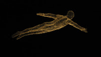
Les Voyageurs (Cedric le Borne, F)
Chicken wire figures suspended over the  South Bailey. Wire presumably dipped in light reflective paint. Elegant figures floating in space.
                                                       
                                            
Plenum  (Simeon Nelson, UK)
Inspired by his fascination with complementary and conflicting accounts of creation found in religion and science. Intriguing projection onto the  face of St  Oswald’s church – starts as a perfect grid of dots which slowly deteriorate into random patterns. V. Powerful nad simple ( in the best sense) work.

I Love Durham  (Jacques Rival  F)
Great.  Essentially playful piece. The statue of the Marquess of Londonderry has been covered in a plastic sphere with artificial snow being blown around inside. Takes me straight back to the childhood  toy  spheres which you shook and turned over before setting them down to provide their snowstorm.

Splash  ( Peter Lewis, Canada)
Transformation  of Ove Arup’s Kingsgate bridge into giant waterfall,  beautifully lit with clear white light and best approached by walking along the riverbank from Prebend’s bridge. Quite magical viewed through the tracery of trees- movement, transience, light.


Wednesday 23 November 2011

Studio Progress 2

Collage progression
1)    Use of lining paper, cut into rectangles approx 500x800, single colour acrylics as source material for tearing cutting into strips. Range of colours loosely derived from paintings based on Isla del Sol and Robbledio.
Most interesting effects from strips of differing sizes. Tension between cut and torn edges interesting.
Feed back from VB – suggest try colours of varying opacity as my current range are all pretty uniform and well saturated.

2)     Varying the opacity liberates possibilities.
3)    Widening range of material
Integration of photos / text from magazines / newspapers. This adds whole new narrative potential, even if not ‘consciously created’! Colour palette greatly reduced which helps hold composition.
'Stripe version attempted, leaving white gap between each colour. Develped vertically but looks rather like rug hanging on the wall! Try various orientations with VB - horizontal version definitely an improvement.

VB suggests go bigger and use studio wall directly.

First wall piece
Collecting material from current magazines / news sources there is plethora of images relating to conflict.
Decide to limit colour range to reds (limited orange /pink) which with strong black and white images makes a suitably apocalyptic palette.

Crit with Lothar provides interesting discussion of role of English landscape in art – his fondness for gardens, which he often uses as a basis for composition of his abstract works. He suggests that my wall collage could provide the ground plan for a garden which indeed it could!

Crit with VB - she suggests relationship with window and geometry of external view- have to confess that whatever rel\ationship exists was arrived at subconsciously / fortuitously.

Second wall piece
Gather source material- negatives / plans (A1) from TGP office and various items from home , particularly grids / netting.
Experiment with dribbling / flicking white emulsion on brown A1 neg.which provides swirling patterns reminiscent of constellations. A way forward of contrasting these essenetially random patterns with the disciplines of grids / squares suggests itself. Also happen  upon striking image of the 'Haj' - essentially iron filing around a magnet by the artist XXXX. Magnetic forces / cosmic forces - something is developing..... 
Initially have difficulty integrating this image - set it on left of compositon ( ten to twelve). Eventually realise that it has to be moved centrally as it such a commanding, concentric image.
Find piece of black nylon netting which chimes well with scale of Haj image rigid grids- 'warped in space - black holes?
Dialogue between ideas and materials is fascinating - I guess if these ever fused into a balanced /exciting compositon that would constitute a successful work.

Third wall piece
VB discussion suggests more at bigger scale and moving into communal  space by Steve's office!
Now hunt is on for more material. 
Agricultural feed bags in bright clours and calendar showing great images of rare breed hens provide a promising start.
Gradual build up - establlish some diagonals to work against the horizontal / vertical  axis of photographic images.
Bigger space is helpful in viewing work as it progresses.
Integrate images of Pope /sheep /barbed wire - not too subtle perhaps but there is something to say about our relationship to animals.                            


.