Monday, 5 November 2012

UPLAND LANDSCAPE 1


Objective
From field observation carried out in the summer months develop language of marks to express the inherent tension in upland landscape between straight, linear patterns (walls) and organic patterns (erosion).

Key Influences
  • Gerhard Richter's blur paintings of landscape
  • Mark Francis, particularly his work utilising subtle grid patterns with other information (blurred) overlaid.
The blurring of the images lends a certain enigmatic quality. Richter's work is still recognisable as landscape. Francis' work is less straightforward in refeerncing its source.


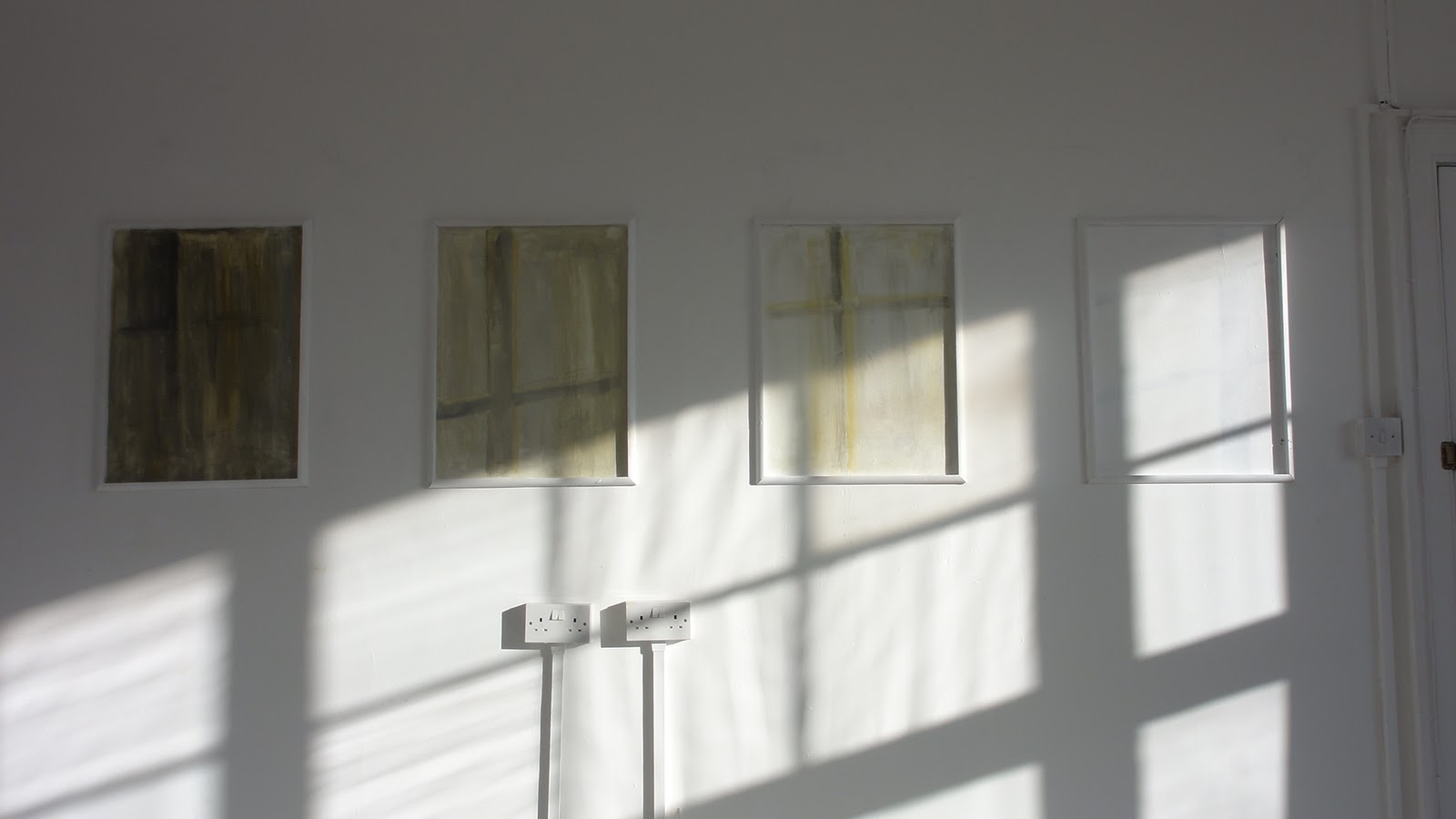
Painting left (510 x 405 mm) - acrylic on canvas washed  with sponge when still wet.N.B. this series all similar dimensions and materials

Developed from paper sketches and observation in the field.


Colour restricted to black Naples yellow and white primed canvas.

Observation
Some sense of perspective acheived without compromising 'abstract quality'. Not fully resolved as a statement.


Critical comment fom Lothar
Markmaking seen as 'clever' which I do not take as a compliment! Suggests I do a series to try and establish what it is I am trying to express.

I like the challenge ..........


Return to more obvious landscape image taken from upland photograph in order to try and test references and way forward. 
                                                                         

Sunday, 4 November 2012

SERIALITY / REPETITON


How might the vacation study be exploited in my new work ?

Agnes Martin experimented with a number of formats and sizes, eventually opting for a 6ft  square which she argued was large enough to not be taken in at one glance. Max Cole although operating at a broadly similar  scale opted for a landscape format which makes sense given her overt expression of interest in landscape

Proposed painting based on 'pulses of light' as in passing clouds
My choice is a standard 2.4 x 1.2m mdf board. Cut into 3 equal sections ( pragmatic -will fit in car!), Module therefore 3nr portrait panels.
  • working with canvass units on primed mdf for textural contrast
  • Colour - seeking backround colour which will be difficult to fix in space - plus foreground colours that would relate in a subtle way.


Experimenting with module size and colour


Backround / module trials


    Finished work


Observations
  • pulsing rhythms not a strong as I had hoped. Discussion with Virginia suggesting reducing tonal contrast which currently runs almost from black to white
  •  very time consuming in preparation- difficult to know how many of which hue/ sturation until placed prior to glueing. Positive side is that this works like a large collage allowing muchh trial and error
  • textural difference between individuall hand cut canvas modules and mdf somewhat flat. None of the life found in hte works of James Hugonin, although his meticulous nad painstking appraoch requre months of input!


Friday, 2 March 2012

NINE PRESENTATION

Nicola and I managed to make it - Lee and Staci had problems ( Lee emailed his proposals but we did not view them).

Nicola had a nice proposal for using the figure '9' mounted proud of the wall, used at varying scales. This went down very well.

Basis of my presentation was to try and treat the whole room as a 'space' rather than a series of walls.
  • ceiling 'searchlight' proposal which picks up on striped wall and bounces off the two long walls seemed to go down well.
  • main wall space proposals picks up on 'nine stitches' by using strips of canvass ( the artist's cloth!)
  • opposing wall uses head/ brain imagery to reflect their essentially cerebral bespoke software input.


  •  Attempt at projected view of room


They seemed very appreciative of our efforts. Left that they would review everything and let s know how they wish to proceed.

Great to be pitching for work on a live project .


Sunday, 12 February 2012

NINE OFFICE MEETING

Meeting held to outline requirements for upgrading their boardroom.
James H plus three fellow students.
 The Company, formed in June 2011. How they see themselves:
  • Not corporate. Individuals providing bespoke solutions for clients. Co name / logo derived from 'stitch in time saves nine' saying. 
  • Project needs to communnicate this.
Current space large white box with some 'off the shelf''  paintings
Main office space cultivating 'laid back image- skateboards on wall, pool table + some work stations!

The Board Room


Their current thinking/ aspirations:
  • End wall (RHS photo above) to be decked out in 'Paul Smith' striped pattern, integrating blinds.
  • Floor to be wood
  • Main white boardroom table a fix, ditto projecttion screen
  •  Door to be replaced with solid door / no window panel. They have idea for painted scene lookinfg out onto some romanticised industrial landscape!
  • Whiteboard can go
  • Like idea of working directly onto walls rather than 'hung pictures'
  • Also want ideas for LHS entrance wall as you enter
Next Steps
  • Ideas for 24th Feb
  • No decision over how commission will be awarded- they will pick what they like
  • Fixed price basis
  • Need to stick to agreed timescales....
Very initial thoughts
  • play with architecture of the space
  • pick up on Paul Smith stripes in some way
  • utilise ceiling to help make this connnection- as in bouncing l'light' from ceiling to wall.
  • utilise bespoke link e.g. canvass directly onto walls as 'artists material' - bespoke charcoal marks??

    Saturday, 4 February 2012

    NGCA Morse Progress

    Morse seems to be a goer:
    • Researching industrial tapes as medium to execute work- obvious links with original tapes which were used as part of the radio telegraph system. Also strong, uniform colour good.
    • Could also view work as geological profile with fosils representing the encoded message....
    • Gallery wall dimensions 4,750 x 2,400mm height
    • Scale of space would be best served by 75mm width tape.
    Content of meesage  important- number of options considered but front runner:
    Hello 
    Sunderland
    The medium is the message
    The medium is the message
    Brain working in the night- wake up with colour idea- red and white for Sunderland, obvious AFC reference.

    Medium is message lines - first in B&W second in colour . Hopefuly viewers will be able to pick up on repeat pattern of symbols- the words are the same but is the message?


     Image related to proportion of 2,750 x 2,400mm space.
    Symbol spacing according to conventions of Morse code..

    Considering
    • Integration of sound element. Discuss with Graham M who says it is doable with current equipment. There are programmes on the net which can transform text directly into morse!
    • Contact with local radio hams and managed to source Straight Key morse teelgraph machine from an enthisiast!
    • Possible opportuinty for kids (space immediately adjacent to propsed wall)- brief, lighthearted explanaation of the 'code' plus invitation for kids to spell out their name in code - if a tally were kept it could itself form an 'abstract artwork'.
    Work up Proposals and get in for 6th Feb...

    Sunday, 29 January 2012

    NGCA Proposal - Feb 16th Jan

    New talent opportunity at NGCA Gallery outlined by Alistair xxxxx, curator.

    AV Festival is approaching seems an appropriate stimulus.
    Consider working around one of my current concerns relating to 'abstract art'. The question of  'meaning' which is often bound up in symbolism, codes and referencs to other works or areas of life.

    Thinking around Morse Code as an abstract code which can be recognised both arurally and visually but only fully intelligible to those familiar with 'the code' - otherwise merely a jumble of abstracct symbols.
     Need to check:
    • dimensions of gallery space - scale / impact
    • best medium to deliver in
    • possible integration of sound (Graham)
    • H&S considerations- can image be applied direct to gallery  wall.


    .

    ..

    Room 106 - 10/01/12

    Follow up n Steve M's suggestion of using Room 106 as next 'collage space'.
    Room faces south and looks over Backhouse Park - wonderful ligh t/ silhouette effects as the low sun moves its way across the heavens.
    Room approx 5.5m square and 3.2m in height.


    Initial thoughts are to exploit the extraordinary and subtle quallity of light:
    • glazed panel indoor provides link  between 'internal building space and Room 106
    • changing shadows make complex patterns which often change swiftly ( links time and landscape perception)
    • translucent coloured adhesive material -direct onto windows ( // stained glas) or layered onto  sherts of glass/ perspex, sequence of which can be changed/ overlapped etc   
    • research Islamic/ Mogul screens
    • Various light filtering /modifying devices- muslin/ trellice work
    • Comntemplative qulaity of space- sacred colours ( Budism) , ecclesiastical purple
    • Icons on shelves/ timber surrounds
    • Hooks in ceiling- consider suspending items- upper layer?
    • Electric sockets quite intrusive -can they be integraated in some way- plugs on back wall form a fairly gaceful arc!
    • utilisation of gradations of colour up walls and across ceiling- controlled band trather than total room space?
    •  use of artificial light- hours of darkness /sun not out /complementary
    • coloured slides  or other projections onto wall space
    First intervention
    •  Pick up on module of door glazing and repeat along solid wall
    • define by latts (as frame) and play with idea of light intensity increasing as progrees towards the large, park facing window.
    • changing silhouette pattern as 'leitmotif'                                                                        


    •  
    •  
    •  
    •  
    •  
    •  
    •  
    •  
    •  
    •  
    •  
    •  
    •  
    •  
    •  
    •  
    •  
    •  
    •  
    •  
    •  
    •  
    •  
    •  
    •  
    •  
    •  
    •  
    •  
    •  
    •  
    •  
    •  
    •  
    •  
    •  
    •  
    •  
    •  
    •  
    •  
    •  
    •  
    •  
    •  
    •  
    •  
    •  
    •  
    •  
    •  
    •  
    •  
    •  
    •  
    •  
    •  
    •  
    •  
    •  
    •  
    • rple