Studio Progress - Finding a Language
Resolve to go as large as possible within confines of the studio space -use approx 2m square unstrecthed canvas treated with PVA diluted with one third water.
Reflection following term end
'Traffic Lights' review and Mondrian discussion have strengthened resolve to reintroduce grids to my work. This approach seems to reflect my concerns over the 'manmade intrusions' upon a 'natural landscape' The grid reflects the inflexibility of the Cartesian view of the world and man's 'dominion over nature' The loose acrylic washes aptly reflect the natural processes - influenced by water and gravity. This provides me with,for the first time, a language with which to attempt to develop my work - no doubt this will morph into something else before too long!
Referencing Mondrian seems important - he worked so hard to remove all landscape reference (or, indeed,any other) from his work although he initailly made many studies based on landscape subjects edging towards total abstraction (e.g. his Tree Series). He sought to restrict the experience of viewing his work to the picture plane - I am trying to introduce a sense of space into the canvas without any overt landscape reference!
His grids which imply a connection beyond the confines of the picture provide a connection which I would wish to emulate (unlike say Agnes Martin whose grids often relate to the picture itself).
Undergrid design options worked out on paper first.
Original thoughts of utilising a Mondrian painting as an underpainting are abandoned in favour of an orthoganol grid, strongly influenced by Mondrian. (This thought was triggered having seen Jim Shaw's work at the Baltic where he produced some stunning extra large works utlising old theatrical drops, most interestingly integrating the original 'theatre painting' into the finished work).
As ideas further worked up two of the strong verticals are canted slightly to the right, breaking the full strictures of the 'Mondrian grid' - this feels good and is 'my statement'.
 Tape sizes available:
75mm
50mm
35mm
25mm
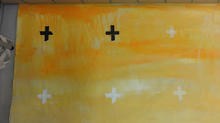
 Grid tape in place
First washes
Further washes, experimenting with complementary colours - yellow / purple. Canvas lifted from top edge to allow latest wash to 'run' creating links between top and bottom of the canvas
 With tape removed
Some bleeding beneath tape
but softening / integration of grid generally welcomed
Observations
- Scale and unstretched nature of canvas quite liberating
- Purple /rich cadminumyellow work well against the neutral canvas -( PVA primed)
- Bleeding of colour into grids not intended but adds to richness of painting - would have been major problem if the work relied on precise, Mondrian like geometry.


